Thursday, 5 June 2014
Wednesday, 4 June 2014
Monday, 13 January 2014
Thursday, 12 December 2013


MJ: Production Update
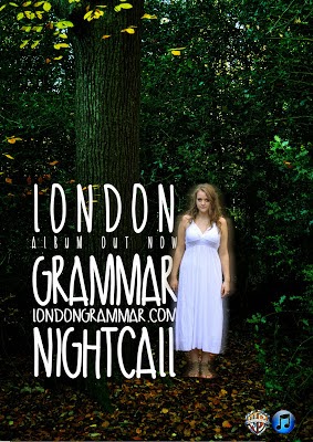
For my song advertisement I have decided to go with the version with the smaller, white lettering. This is because the reading line goes straight to Chessie's character, with the blur effect that makes her stand out more and then the path will fall on the text next to her.

The ethereal white effect also brings out the green overtones of the forest scene, which makes the advertisement look pretty as well as standing out from other advertisements.
The ethereal white effect also brings out the green overtones of the forest scene, which makes the advertisement look pretty as well as standing out from other advertisements.
Group: Plan For Audience Research
In order to collect as much audience research relating to our video, digipak and advert, we have decided to send out our video campaign via social media such as Facebook and email to gain as many responses as possible. As well as this, we have planned a focus group for Monday to gain more feedback from a controlled demographic of our audience.
After Monday, we will collect all of our results from both methods, and evaluate them.
After Monday, we will collect all of our results from both methods, and evaluate them.
Monday, 9 December 2013
FA: Digipak Update
Whilst Matt has been working on the music video production for some of today, I have been working on my digipak, and have almost finished. Currently, I am just choosing whether to go for a black and white effect, or to keep some colour:

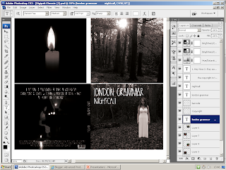
The candle image in the top left is not my own, as I am planning to take an image tonight of the candles used in our first shoot to replace this.

Friday, 6 December 2013
Wednesday, 4 December 2013
Feedback On Progress
Looking a bit on the minimal side you two, I will be checking again tomorrow in which I hope to see some more detailed posts on your progress so far. I also need an update for the music video, I want to see a reworking of the opening performance scene, so you should export your newer version.
MJ: Print Work - Advert Update

In this reworked version of my magazine advert the size of the font has been resized so that it is the same size as Chessie's ghost character.
Tuesday, 3 December 2013
FA: Digipak Progress
Today I have been working on the Digipak campaign. I have transferred my images to Photoshop and have been working on the layout.

Aspects I still need to work on include:

Aspects I still need to work on include:
- changing the font to the chosen one from dafonts.com (I need to download this from the website)
- choosing a more suitable image for the back cover
Monday, 2 December 2013
MJ: Advertisement Progress

For this version of my advert I have edited the picture so that Chessie is on a different layer to the picture. This means that I can alter the colour of the forest whilst Chessie stays the same colour.
For the creation of the titles I used a process in which the whole layer of the picture is copied and then placed over the top of the original, I then used the font tool to write the titles.
It is a very effective look, however some have said that it is quite difficult to read, and personally I feel that, even though I like it a lot, it looks more like it would be more suited to an album for a dance track, rather than a mellow indie track.
Sunday, 1 December 2013
Rough Cut Feedback
1. Some examples of A grade shots, where the footage works particularly well with the music. The concept is appropriate for the sound and the editing is beginning to show good selection of shots.
2. The vignette at the beginning of the wood scene is better than the rather more defined circular one which you then switch to. The shots in the wood need sequencing correctly as the narrative doesn't appear to be in the right order at present. The performance in the hall is much improved and some of the shots on Chessie and tracking in and out are lovely. Not all the pans are working because of background and the angle the camera ends up it. This however could be beautiful, I suggest if you are running out of time, that you export this footage onto another time line on a different computer and each work on a different bit of the narrative.
3. You should shoot performance outside as originally planned, this is what is missing and I think would enhance it.
4. Print work is progressing well. The blur effect on the images - I don't think works. The shot of Matt is appropriate but needs to be a stronger selection from your images. You examples of found images lower down on the blog are good examples. There is clear evidence of a cohesive band image here so it is worth working on the images to get the best ones.
Blog: is showing development of ideas and reflect. You need to ensure that you are using more media terms in your analysis and keep it technical and detailed. Bullet points are better than continuous prose.
5. Your music video is currently a level 3 but could be a level 4 (A) as I have seen the evidence from the shoot. You are losing marks for this part of the criteria: "...including controlled use of the camera, attention to framing, ...and close attention to mise en scene." 26/40 + a mid C.
Friday, 29 November 2013
FA: Digipak Rough Cut

Here is my rough cut of the digipak for our music video promotion. As the 'rough cut' title suggests, the images need some work and are unfinished. The font will be the same but in white so it stands out more. I have gone for a black and white theme here, but may make some alterations as I feel that it does not reflect our video completely as we have decided not to use black and white at all in the production.
MJ: Advertisement Rough Cut

In my rough version of the magazine advertisement so far I have added the picture in, which was originally too small to fit the page, but by copying sections of the picture and merging them with the two sides of the picture I have been able to overcome this problem. Originally the two sides did not look right, but by colour grading the sides using the Curves tool on Adobe Photoshop CS3 I have been able to make them look almost part of the picture.
I have also made the forest a brighter, more ethereal, green by cutting Chessie character out whilst using the Curves function to make the greens brighter.
As for the titles, these will not be used for the completed piece, however I quite like the look of this font, as the way that much of the word blends in with the picture gives it a ghostly feel. However I do still prefer the original, as used on the digipak that will fit with the band image.
Group: Second Rough Cut
As we continue to work on our music video production, we have created a second 'rough cut', where we have put the Vignette Effect onto the video. Again, it isn't complete yet and has its flaws which we will be working on during the next week.
Thursday, 28 November 2013
Group: Rough Cut
When making our rough cut, it was plain to see that we needed to do another shoot to fill up our timeline as we only have about 60% of our footage so far, so we have decided to take another shoot on Friday (29th) of Matt in the woods, and then a performance shoot on Monday (2nd). Apart from having to shoot these other scenes, we feel that since our concept change, we have made some steady progress and are now on our way to confidently finishing in time for our deadline.
MJ: Work Progress
28.11.13
Yesterday Chessie and I spent a combined three hours into the project, attempting to create a rough cut that gives us a basic template of how the video will begin and end, with other shots in the middle. When we had finished we felt much more confident about our project, understanding what needs to be re-filmed or for extra shoots, as well as the amount of footage we have to work on at the moment.
Much of the time was simply spent dropping and dragging clips onto the timeline and editing them there, however when we were more confident with what we had so far we began experimenting with different effects, such as the "Time Stretch" effect, which works very effectively. Also we found some effects in Adobe Premiere Elements don't work in our video, such as the zooming effect.
FA: Work Progress
28.11.13
Today I have been practicing using a Vignette Effect from Photoshop on still images. I have been using a tutorial which I found:
http://www.photoshopessentials.com/photo-effects/vignette/
This has been very useful and is extremely easy to understand, as for someone who has barely used Photoshop before, I was able to create the following images.


I still need to practise creating this effect on our video, as I assume it will be harder to do create on a moving image. To create a Vignette Effect on our moving image in Premiere Elements, I have created an effect on Photoshop which has a transparent background, which is then layered as a still onto Premiere. Here is an example of this effect created on Photoshop.


Wednesday, 27 November 2013
Group: Project Update
27.11.13
After showing our rough cut, which was much shorter due to lack of time to complete, we carried on working on the music video. We are happy with shots we have and believe that it will take up the 4minutes of the song, however we have been advised that we should do another shoot, which will take place on Friday the 29th November.
We are currently producing a full rough cut, so that we know what is missing or needs to be re-shot. We will be spending a lot of our extra time to get this, and the rest of the project, sorted.
Group: Audience Research - Rough Cut
Feedback:
- We have a nice panning shot, however it does get shaky at some points and so we could do with using AfterEffects to make it much more smooth.
- At time the light levels changed.
- The mise-en-scene used is good and fits the style of the track.
- Some of the shots are too long, and so need cutting.
- There is a nice use of distance variety, e.g. a mix of long shots and close ups.
- Some of the performance needs editing as it either is not a necessary part or it does not look like the character is actually singing.
- The part of the pan in which only the piano can be seen needs to be cut as it is not needed and is out of place.
- The canted angle is in the wrong place, too long and supposedly too extreme for use within the video.
Monday, 25 November 2013
Group: Campaign - Band Image


The brief was to begin producing the advert and digipak, using either our own images or found images. The above show our first efforts, using solely found images (which will be replaced later with our own footage) with the digipak efforts at the top and the advert at the bottom.
We have set out to create a cohesive band image to promote the album through the use of dark imagery and the look of being lost, as shown by the girl in the dark, Alice in Wonderland-like forest, as well as the boy in the digipak who looks like he is lost and searching for something.
The advert is designed to run in Q Magazine, as Q focusses a lot on pop music as well as more indie styles of music, and London Grammar fit into both of those categories.
We chose to design an A4 advertisement as it allows a lot of focus to go into the dark wood, whilst allowing the characters to be shown as small in comparison to the woods but not small enough that they are difficult to see.
The use of visual motifs that will be in our advert and digipak will represent the notion of being lost, for example things are easy to lose in the woods. As well as the pendent that is used in the video and advert represents the past in a bleak manor.
The leading line of the advert is the picture in the centre of the page, leading up to the bands name and then the album name.
The text anchors the images through the way that it is dark in the pictures, representing night to match the title of "Nightcall".
Friday, 22 November 2013
FA: Update
For the past few days, myself and Matt have been busy editing the first portion of our shoot, and creating ideas and rough copies of our digipak and advert. Here are a few ideas and first drafts of our digipak.


Tuesday, 19 November 2013
Group: Filming
18.11.13
We found that our filming on Monday went extremely well; we were able to produce all of the shots that we feel necessary for the beginning part of our music video and for some filler shots.

Here are some of the clips that we shot for the most part of the first half of the song. They are unedited which means that occasionally a member of the crew may be seen in the background or an object, such as a fan, which will later be corrected in editing.
Thursday, 14 November 2013
Group: Major Concept Development
Due to many issues myself and Matt have come across over the past few weeks, we have decided to completely change our music video to a more narrative based video. We sat down and listened to our chosen track and came up with our new concept:
- The first instrumental part of the song (28 seconds), the female performer is shown playing the piano in a room all alone. The camera tracks around her with a romantic yet edgy atmosphere, lit by spotlights and candles.
- As the narrative begins, a male is shown in an outside location looking for something unknown to the audience.
- When the narrative progresses, it becomes clear that he is looking for the same girl who is performing.
- The girl then appears in the narrative as a ghostly figure, who is guiding the boy towards something in a hurried manner.
- The narrative will then reflect the lyrics 'I'm going to show you where its dumped' which will eventually lead to the body of the female having been murdered.
- The end shot will be the boy opening the locket in the female's hand to see a picture of them both.
Friday, 8 November 2013
Group: First Shoot Reflection
As planned, last night we filmed some of our music video. We set up in the drama studio at 3.30 and filmed Chessie lip-syncing as our artist. We used large torches as our light source which gave our footage a dark, moody atmosphere which we were trying to create. However, as we had such a dark image, when we uploaded the footage onto the computer to start to edit it, the footage was grainy due to the settings of the camera automatically adjusting to allow more light in.

Our next shoot is Monday 11th November, where we will film Ben, our protagonist.

Our next shoot is Monday 11th November, where we will film Ben, our protagonist.
Thursday, 7 November 2013
MJ: Advertisement Ideas
The main plan of the advert is to be fairly basic, with the title of the band and digipak at the top in bold, they are likely to be coloured white in order for it to stand out from the dark background.
The image will be fairly minimalist, with the girl from the video shown in the same dark room as the boy, however there is quite a large distance between them and the girl is seen to be screaming (calling) as he is sat on the floor. To add to the atmosphere and the fact that the word "night" is included, we are going to add an image of the moon, that will cast a dark blue tint over the girl, to show that the boy is a much darker character. This also fits the mood of the song as the song sounds like one that would be played during the night around a camp fire with a group of teenagers camping over the weekend.
The image will be fairly minimalist, with the girl from the video shown in the same dark room as the boy, however there is quite a large distance between them and the girl is seen to be screaming (calling) as he is sat on the floor. To add to the atmosphere and the fact that the word "night" is included, we are going to add an image of the moon, that will cast a dark blue tint over the girl, to show that the boy is a much darker character. This also fits the mood of the song as the song sounds like one that would be played during the night around a camp fire with a group of teenagers camping over the weekend.
FA: Digipak Ideas
Front Cover
- split screen with our male protagonist on one side with a gloomy expression, and our artist on the other side trying to 'get through' to the boy as if she is the boy's conscience
- 'London Grammar' in large white letters above the picture
- 'Nightcall' also in large white letters below the picture, both in the same font, such as this one called 'passion tea' from dafonts.com
- a picture of a moon above both characters in the middle of the picture, underneath the title of the band which will have a blue tint surrounding it, to represent the 'night' in 'nightcall'

Back Cover
- a faded or washed out picture of the boy screaming with a dark wash
- the same white font as on the front cover lists the tracks from the album
- bar code, and any smallprint needed will be at the bottom of the frame
Group: Animatic
From looking at the animatic we can immediately see that the shots we had planned to use would not fill up the song time, with large blocks of nothing being present within the animatic. This has made us think harder about what we are going to do to ensure we do have a full music video. One of our ideas is to use projectors to present various POV events from the boy's life, and have him watching and gradually getting closer until the conclusion. Another idea is to have various items that are stereotypical of teenage boys scattered around as the boy is seated in the centre, this would include objects like a watch, headphones, books, magazines and other items of clothing.
Tuesday, 5 November 2013
Group: Term 1 Review
To meet the upcoming deadline for our music video, digipak and magazine advertisement, myself and Matt need to make sure that our ideas that we have are then shown in the visuals. At the moment, we feel that our ideas will be unable to be seen effectively in our video. Due to this, we have decided that we need to get more organised and work through the song in the drama studio. Therefore:
- first shoot - 7th November at 3.30pm, filming my character (Chessie) in the drama studio
- second shoot - 11th November at 3.30pm, filming our protagonist, Ben, in the drama studio
- third shoot - 14th November at 3.30pm, filming Ben and the background characters, in the drama studio
- fourth shoot - 16th November at 10am, filming POV shots, in our homes/outside locations
Thursday, 24 October 2013
Group: First Shoot Plan
Having experienced some problems with our location over our half-term holiday, we are unable to start filming next week. Having had an idea about how to create more action and filler shots, we have decided to include some flashback shots of our protagonist being bullied as a child, or suffering some problems with his parents. In these shots, we will make sure that something sentimental is shown in the shot, such as the boy holding a teddy bear, which we then be shown being destroyed i.e. burnt or something similar to that effect.
We will show this as POV shots which we will project into the room we are filming in, and shoot our protagonist as if he is watching them. Due to this location problem, we have decided to shoot all of our 'outside' footage, i.e. all of the shots not in the dark room, during half term to make sure we can start our production process.
We will show this as POV shots which we will project into the room we are filming in, and shoot our protagonist as if he is watching them. Due to this location problem, we have decided to shoot all of our 'outside' footage, i.e. all of the shots not in the dark room, during half term to make sure we can start our production process.
Friday, 18 October 2013
Group: Location Reccie
For our production, we want to create a simple, symbolic atmosphere which we think would be appropriate for our concept. Having decided this, filming in a studio would be best suited for us. We then took some practise shots in this drama studio to give us an idea of some of the angles and distances we could use in our music video.


We want to create a whole black space, but as the drama studio we are going to use is only partially black, we will have our lighting facing the black wall; therefore when the camera pans around the artist's head, all the camera will show is a silhouette with the background obscured by bright lights.
Tuesday, 15 October 2013
Group: Concept Development
Today we were working on our storyboard and animatic as part of our planning process for out music video. Below are some examples of our initial moodboard drawings.


Monday, 14 October 2013
Sunday, 13 October 2013
Group: Pitch
Constructive Criticism:
- incorporating lots of filler/meat shots is a necessity to make sure that our music video is full of action and is exciting to watch multiple times
- uncertainty of filling the song time, so more action shots are needed such as the smashing of glass etc
- more location reccies should be carried out due to the studio we wanted to use possibly being too small to fit our intended cast size into
- however, when we presented our pitch to our teachers and peers, they all agreed after listening to our chosen song that our concept fully matches the audio
Tuesday, 1 October 2013
Group: Concept Development
- first shot: split screen with one screen showing a male teenager sat on the floor of a dark room on his own and the other screen showing the female singer standing in the same room with a microphone. The first narrative of the boy is in a coloured gradient, whereas the female is shown in greyscale. Atmospheric lighting e.g. spotlight and candles.
- The word 'nightcall' shows up over the top of the split screen.
- As the lyrics begin, the female is shown in the same room on her own singing the lyrics, as the narrative switches between her and the boy.
Issues:
- actors - getting people to volunteer to act/perform is difficult, and arranging times where everyone involved including cast and crew are available to film at one time is also a difficult task
- location - finding the 'perfect' location is difficult as the blacked-out drama studio may not be suitable enough to fit all of our cast in, so we may have to choose another location i.e. a barn or something similar
- action - our concept is simple yet symbollic, which means that the visuals may lack in action, so we may need to include an extra narrative, or include more of a back-story to the boy
Monday, 30 September 2013

FA: Deconstructing A Digipak
Coldplay - Viva La Vida

Genre
Media Language
·
The subtle tone and bland colours displayed on the digipak are trademarks of Coldplay, who are known for
some of their slow relaxing music, which could be related to the traditional
art and subtle tones which are evident on the digipak.
·
The only real reference to culture in the digipak is the painting, which could be from the civil
war era; a symbol of more upper class, or arty audiences. This immediately rules
out a large audience from choosing to buy this
album, and this therefore means that Coldplay are aiming for a select target audience.
Representation
Institution and Audience
Sunday, 29 September 2013
Tuesday, 24 September 2013
FA: Music Video Technical Analysis
Coldplay - Clocks
- over 90% of the shots used in this video are meat shots of the band, featuring the lead singer
- the cutting rate is very fast, but slows down when the song slows down, which is quite conventional of this genre
- the costumes the band wears fits in with the background of the studio - dark and dull
- the rule of thirds is always present
- the lead singer is sometimes positioned in the middle of the frame, breaking the fourth wall to connect the artist with the audience
Shot Number
|
Duration (seconds)
|
Camera
|
Mise en Scene
|
1
|
4
|
Low angle, medium close up, static.
|
Man walking past the camera, drum kit.
|
2
|
15
|
Worms eye view, zoom out, mid shot.
|
Same man on piano. Dark clothes.
|
3
|
1
|
Low angle, medium close up.
|
Backlit. Dark shadows
|
4
|
3
|
Mid Shot, static.
|
Band playing, dark clothes, flashing lights
|
5
|
2
|
Mid shot, pan up.
|
Man playing guitar, pan up to blue lighting
|
6
|
3
|
Low angle, static, mid shot
|
Band playing with guitarist central. Dark clothing and shadows. Blue lighting
|
7
|
5
|
Mid shot, slow motion, handicam
|
More lighting on the artists. Dark clothes, blue lighting.
|
8
|
2
|
Medium long shot, low angle. Slow motion
|
Blue lighting, dark jacket. More front lighting
|
9
|
3
|
Close up, handicam
|
Left side of singers face lit up. Shadow on right side.
|
10
|
5
|
Over the shoulder shot to long shot. Handicam
|
Band playing. Blue lighting. Dark feel and clothing.
|
11
|
7
|
Mid shot, static. On the left hand third
|
Dark backdrop, microphone with lead singer.
|
12
|
6
|
Handicam, medium close up. Right hand rule of thirds, pull focus at end of shot
|
Bright light on singers face, contrasts dark background
|
13
|
3
|
Medium long shot, smooth handicam.
|
Blue lighting casting shadows, guitarist
|
14
|
4
|
Zoom out, Mid shot
|
Blue lighting, strobe, drummer
|
15
|
4
|
Static Medium close up Singer on right third.
|
Blue/ yellow lighting shadowing the face. Microphone, band in backdrop
|
16
|
2
|
Medium close up, singer on right third swaying, slow motion. Handicam
|
Blue neon lights, microphone, dark clothing.
|
17
|
2
|
Handicam, Mid shot
|
White lighting casting shadow’s and silhouettes of heads.
|
18
|
1
|
Hadicam, Medium close up.
|
Silhouettes cast by blue lighting strobe.
|
19
|
3
|
Mid shot, Low angle, static, singer on left third of the frame.
|
Blue lighting, dark clothing, lip syncing
|
20
|
3
|
Static, Close up. Singers head central in frame. Shallow focus.
|
Yellow, blue and orange lighting cast over the face and backdrop.
|
21
|
2
|
Mid shot, steady Handicam
|
Band playing, dark clothes, yellow/ white lighting strobe.
|
22
|
3
|
Mid shot, Static
|
Drummer, wide angle, blue strobing
|
23
|
2
|
Medium long shot, bassist on right hand third.
|
Bassist playing, drummer in background.
|
24
|
1
|
Medium long shot. Guitarist on left third. Static
|
Blue lighting flash, blue/black feel.
|
25
|
1
|
Mid shot, Slow motion smooth handicam
|
Blue lighting microphone
|
26
|
1
|
Medium long shot, handicam. Slow motion
|
Blue/ white strobing. Singer dancing
|
27
|
2
|
Long shot, static. High angle. Wide angle
|
White/ blue strobe
|
28
|
3
|
Handicam, pan left/right
|
Singer dancing, microphone. Strobing white and blue lights. Microphone.
|
29
|
3
|
Medium long shot, low angle at feet.
|
White/blue lighting band playing. Only lower halves shown.
|
30
|
4
|
Over shoulder shot. Shallow focus. static
|
White/ blue strobing, band playing, slow motion.
|
31
|
3
|
Shallow focus, static. Slow motion Medium long shot/close up
|
Close up of silhouetted head with singer in background out of focus. Blue/ white lighting
|
32
|
2
|
Close up, slow motion, singer on left hand third.
|
White/red lighting casting shadow over face. microphone
|
33
|
3
|
Pan right, mid shot. Handicam, slow motion.
|
Red strobing. Guitarists centred with drummer playing
|
34
|
1
|
Handicam, slow motion. Mid shot
|
Red/blue lighting in backdrop. Band playing singer central.
|
35
|
5
|
Track from right to left. Long shot. Slow motion
|
Red/ white strobing black clothing and shadows.
|
36
|
2
|
Handicam, close up.
|
Red lighting cast over backdrop and face. Microphone seen.
|
37
|
2
|
Mid shot, low camera angle.
|
Very red, high contrast man playing bass guitar.
|
38
|
2
|
Smooth handicam, close up.
|
Red lighting cast over backdrop and face. Microphone seen.
|
39
|
3
|
Ped up. Mid close up.
|
Light yellow/red light.
|
40
|
1
|
Handicam, mid shot. Slow motion, low angle
|
White light through flooring. Slow motion walking
|
Subscribe to:
Posts (Atom)